

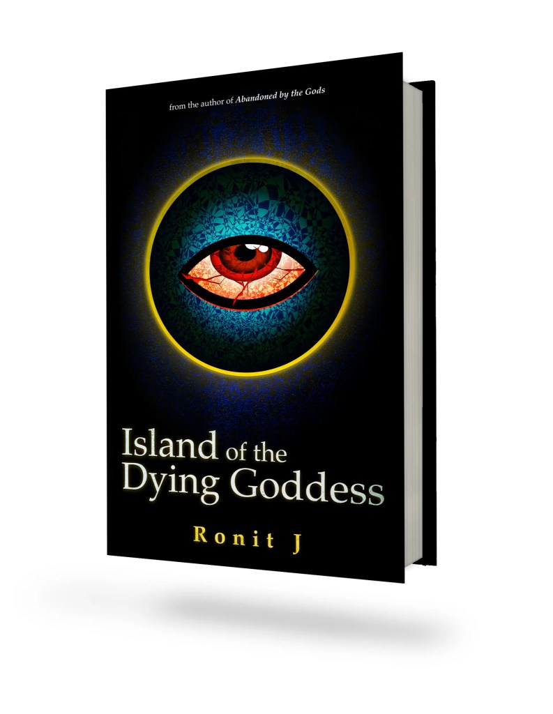
Cover: Island Of The Dying Goddess
Artist: ME
You read that right. Apart from the metallic texture on the Typography, I made everything else inside the cover for Island of the Dying Goddess from scratch. Long story short, I used free tools, spent hours researching covers and figuring out what I was capable of. Then, I spent just as many hours experimenting.
So, without further ado—
How I Made The Cover: Island of the Dying Goddess
The Why:
The short answer is I couldn’t afford to pay an artist. In my honest opinion, if you have the money, please invest in a good artist/illustrator. Because these folks have spent countless hours honing their skills. They will do justice to your book (provided you clearly explain your vision and book, of course).
While I have managed to snag sales, the number hasn’t been big enough for me to reinvest that money into cover art. Yet. Plus, I used to doodle stuff in my notebooks and textbooks all the time. And, I have some experience with design tools and illustration. So, I had a choice before me: Spend money, or spend time and effort. I chose the latter.
I haven’t clocked myself, but I spent around three months between the first rough draft and the final draft of the cover. In case you’re wondering, here’s a side-by-side comparison:

I originally was going to illustrate the island as a landscape image using the Sketchbook App on my phone. The plan was to use this crude Figma illustration as a template (inspirations attached next to it). However, I wasn’t able to establish mood and atmosphere. My skills as an artist weren’t good enough.
So, I eventually scratched that idea and decided to take a different approach.
The Eye:
I’ll admit, the inspiration behind using the Eye came from a bunch of different covers, particularly the God Eater Saga. I mean, just look at these slick covers:

They perfectly capture the elegance of the divine and epic tale they contain with their pages. I wanted my cover to do similar justice to my own subject matter. Which led me to a recurring motif in my book. The Eye.
I won’t spoil what the Eye is or what it represents. But it is important enough to be featured on the cover. The Eye is intentionally designed to evoke a sense of erosion and death, of time passing and life fading. Confession: the Eye wasn’t in the rough draft of my manuscript at all. I added a slightly different version of the Eye in a later draft. Then, I modified it more to match the cover design, because it thematically fit the story I was telling.
In a way, the cover design actually helped me make my story all the more compelling. I find that nugget of information quite fascinating.
The Tools I Used To Make The Cover:
Tools Used: Figma, iPhone 13 Camera.
Different Layers:

Above, you’ll see the basic layers of the cover design. Each element was individually made within Figma. Only the grey texture was a photo of my wardrobe’s sun mica.
The fragmented texture, which makes up the main base, is created with a whole bunch of randomly sized circles scattered together and then combined using the ‘Exclude’ tool. Then, I added a radial fill to the merged image layer, creating what you see.
For each element, I spent hours figuring out the best colours and layout. Once they were in place, I experimented with different blending modes before settling on the one you see. The Excluded circles layer uses “Saturation”, below which is my grey texture with “Overlay” and finally the blue rectangle. Together, they form the background for my cover.
The Eye took much longer to create. While I got the base of the Eye easily, it took months of experiments before it reached its current state. I added the jaundiced yellow and red colours along with the cracks to make the eye look like it was sick and dying. A suggestion from my friend, who pointed out that the eye looked very healthy, contradicting the ‘Dying’ part of my title.
Island of the Dying Goddess – Cover Evolution:

Notice there’s barely any difference in Drafts 4 & 5? I first used a stock image for the background texture. But then, I decided to switch to the grey photo because I wanted as few external elements as possible.
If you want to see a higher resolution video of this, check out the reel I made.
Only the Typography features a stock image from unsplashed.com. It’s this one. It’s a simple mask. I wish I could have found a good enough metallic texture. But, I really couldn’t get the photo right. So, I stuck to the stock image, and have credited it in my copyright page for full disclosure.
Using AI For Cover Art
Now that we’re at the end, let’s address the elephant in the room. AI.
And let me make this very clear: NO, I will never use AI for any of my creative work. For references and experimentation? Maybe. If my job demands it? Yes, I won’t have a choice there. But for my personal creations, the ones I spent countless hours perfecting with the skills I’ve developed? Fuck no.
While I understand that many artists and authors are using AI for their artwork and covers, I remain philosophically opposed to it. I won’t preach you to stop using AI, because honestly it has a ton of applications. Hell, as a creative director, I used AI in my last job because we were asked to.
However, this is where I draw the line: AI is a great tool for reference and experimentation, but a horrible one for creation. Meme lords can have all the fun with it, but if you’re a serious artist, would you really feel okay about letting someone else do the work so you can take credit?
People argue that not everyone can afford to pay artists to create their covers. So here I am, being the exception. I could neither afford an artist, nor am I a super-talented illustrator. Yet, I put in the time and effort needed to hone that skill. Is my cover the best out there? Far from it. But, it’s good enough for me. At least in the current stage of my writing career.
Final Thoughts
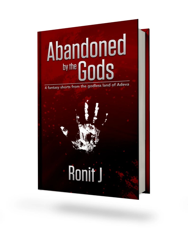
I learned a lot as a designer when making the cover for Island of the Dying Goddess. You can clearly see my growth from the Abandoned by the Gods cover. I genuinely believe my new cover is a significant upgrade, and motivates me to keep learning.
What do you think of my cover for Island of the Dying Goddess? Let me know in the comments below!
Also check out:


![[Review] Predestination (2014) | Ethan Hawke | Sarah Snook | Time Travel Film | Amazon Prime Video](https://ronitjauthor.com/wp-content/uploads/2025/07/Predestination-2014-Review-by-Ronit-J-featuring-Sarah-Snook-Ethan-Hawke.webp)
![[Review] Rick & Morty Season 9 | Episodes Ranked](https://ronitjauthor.com/wp-content/uploads/2026/07/Rick-Morty-Season-9-Review-by-Ronit-J.webp)
Leave a Reply